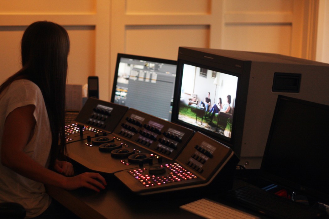
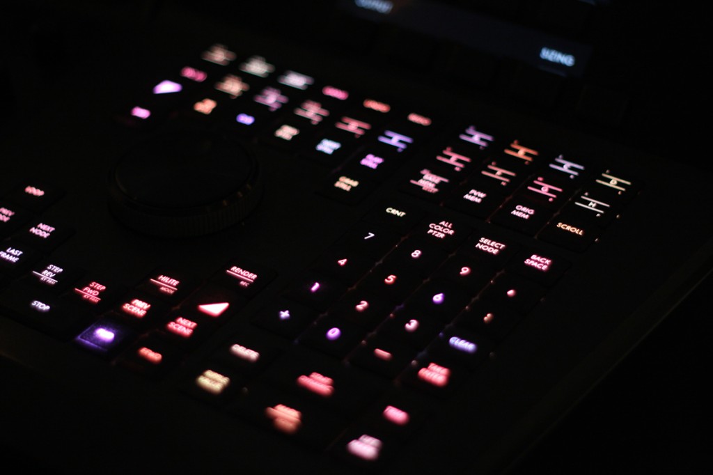
“When I tell people I’m a Colourist, they’ll often ask me what I think of their hair colour.” It’s a funny anecdote, but is also an interesting commentary on the reputation of colour grading in the wider world. Namely – that it doesn’t really have one. Most people don’t know what a Colourist is, and a lot of us in the film industry don’t really understand it. Big machines in nice studios, right?
Story by Paddy Macrae
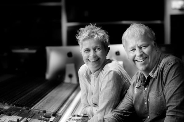
I caught up with Ros Di Sisto, Colourist at Method Studios in Melbourne, about what it is she does, and why.
“A Colourist is someone who makes pretty pictures” Ros tells me. “It’s manipulating images using contrast, colour and light. Kind of like Photoshop on steroids.” Makes sense, but I’m going to delve a little deeper than that.
THE PROCESS
Paddy: Ros, can you tell me a bit about the process? How does you job actually work in a practical sense?
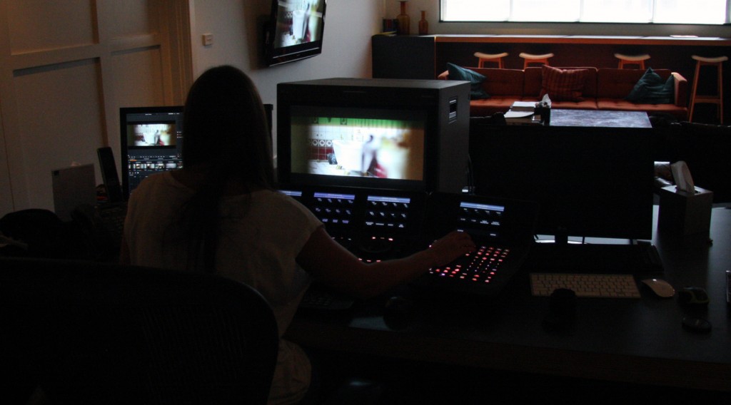
Ros: Most commercial jobs are done within half a day or a day. Once you get in here and you have everyone in the same room, decisions are made fast and things can move quite quickly. We can have anywhere from just the Director in the room, to a whole flurry of agency creatives and clients as well, depending on the size of the job.
Paddy: How do you work in terms of your relationship with the Cinematographer?
Ros: It differs depending on the job. Sometimes the Cinematographer is really involved in the process, and other times I won’t even know who shot it. Often they’re not asked to come in to the grade, which is quite a new thing, and a bit of a shame. Occasionally a mood board will have been put together for me to reference, or for DPs I have closer relationships with, a phone conversations is enough to make sure we’re on the same page. This is more common with passion projects like short films, where there’s a big personal investment from the key creatives.
CAMERAS AND FORMATS
Paddy: I imagine the changing camera scene in the past few years has had a big
impact on your job, and what people are delivering you, can you comment on that?
Ros: When the 5D came onto the market, it really took over for a short time. Budgets dropped, and the standards dropped with them. It didn’t take long though for people to realise for a really top end look, it just wasn’t going to hold up to the higher end cameras.
We have a lot of Red come through, but I’d say about 60% of what I grade is Alexa, which is great, because it’s my personal favorite.
Red can be very beautiful when it’s lit well and the DP knows the camera, but for me Alexa feels smoother to grade. Grading is often done by feel, and the Alexa has quite a good feel about it. It handles highlights very nicely, and generally just has a good range of exposure.
It does have a very clean look – which is good for some things, and less so for others. We’ve also done a few tests with the BlackMagic Cinema camera, which is one I’d like to see more of.
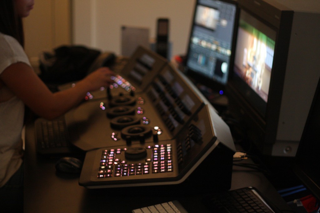
I grade on Da Vinci Resolve, which seems to be developing as the industry standard. It’s very intuitive, user friendly, and has very powerful capabilities.
With Resolve, you can adjust luminance without adjusting chrominance, which is its claim to fame, and can be a nice advantage in some grades. Another platform, Lustre, has other great abilities like drawing shapes and mattes more specifically, so there are obviously pros and cons with both. I’d say Resolve is perhaps friendlier, where Lustre is more robust, more old-school.
ROS’S JOURNEY
Paddy: And how do you become a Colourist?
Ros: I started as a Tape Room / Offline Assistant, thinking I’d like to go down the offline path. At the time I was making my own work – directing, cutting and grading, using the limited knowledge that I’d got grading stills in Photoshop over the years.
Offline was a long road – I figured it might take me 5 to 10 years before getting anywhere, and I was enjoying colour more and more. Considering at the time Method Studios (then MRPPP) didn’t have a grading suite, I thought it was the perfect gap for me to fill.
After some basic self-training, I decided to start contacting people I knew higher up in the field, and target companies that were doing the best grading work. Soon after, an opportunity arose with Deluxe’s purchase of MRPPP, and I threw myself into it from there.
CURRENT TRENDS
Paddy: Watching content from the past 20 years, it’s pretty easy to see visual trends over periods. What’s in now?
Ros: There’s been a huge trend over the past couple of years, which I think has had it’s run, which is a fluffy, pastel, C-Log look. This basically just means really high blacks, no contrast and very muted colours. This look can work beautifully on certain things, but as trends go, in my opinion, it has just become a bit overused.
I think the future for grading is in feature film. Commercial budgets are getting lower and lower, and the expectations are getting higher and higher. The nature of accessible digital film making means that budgets are now pretty stifled, which has especially been evident in Television Commercials and the small screen.
Potentially we may see a demise in high-end postproduction at the commercial end, which is a bit sad, because it can only mean a drop in the craft. If you’ve had the pleasure of going through the experience of using the top end artists and gear, you’ll know how superior the results of a professional grade are.
Online is changing the game as well – we now have cinema versions, TV versions and online versions too. This is new ground.
Sometimes we even have to slightly compensate in the grade because we know that the material will only ever see be seen on an uncalibrated and contrast-heavy computer screen. For example, if there were really intricate black level adjustments, and you knew the content was going to be seen mainly on low-end computer monitors which crunch everything, this would be taken into account when adjusting.
Paddy: I can’t seem to get away from discussions about 4K, and larger. From a colour perspective – is it worth the bother?
Ros: For the small screen, it makes no difference. A lot of people come in with music clips on tiny budgets and want 5K renders for YouTube release. That’s just unnecessary. The human eye simply won’t pick it up, and very few screens can show the difference in resolution anyway.
It’s great to work from these large files – we have the latitude to do better keys and the resolution to do heavy reframes, but for output, it doesn’t need to be anything bigger that HD if it’s going to TV or the internet. For cinema, sure, there’s a lot more sense in utilising the full frame.
ADVICE
Paddy: Have you got any advice, Ros, for aspiring Colourists?
Ros: If I were going to give advice, it would be to do as much grading as possible, and learn your tools well. Get in touch with film students, and aspiring filmmakers, and try to work on as many different projects as possible.
Find your way around the software so that when an opportunity presents itself, you’ll be one step ahead and already have a showreel of work. I had friends shoot things for me just so I could practice my skills. Getting advice from people established in the industry is also a great idea, and talking to other Colourists who may have advice to give.
TIPS FOR SHOOTING
Paddy: Got any hints for Cinematographers that would lead to a better grade?
Ros: The golden rule is that you want your blacks and whites to be as soft as possible. Make sure you’re well exposed, and the whole image looks flat; this gives your Colourist the best range to work with.
I think everyone, especially DPs, should experience a professional grade. It’s an incredible process of collaboration, and can do great things for the images to bounce ideas around with someone who does it every day. It’s worth saving up a bit of cash, picking a project you’re proud of, and experiencing a professional grade. Anyway, if the work itself doesn’t win you over, the free coffee, chocolate and comfy couches to surely will!

Juan Albarrán
Very insightful article!