This article was originally posted on zacuto.com. Zacuto creates production grade, filmmaking camera accessories designed by filmmakers for filmmakers. Zacuto’s blog is written by a wide variety of filmmakers and includes How To articles, production diaries, sneak peeks at new cameras, and more. Learn more about Zacuto by following them on Twitter, Instagram, Faceboo
I’d like to share my journey through color correction with you, in the hopes of helping you teach yourself how to become a colourist.
Written by Bruce Logan, ASC.
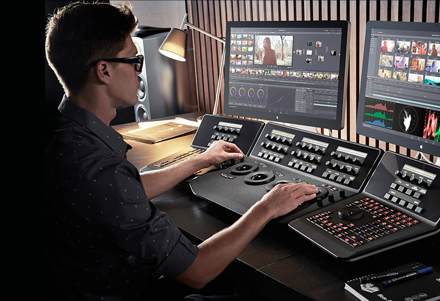
And so, it began. Armed with my Ikegami HLM-2450W color-correction monitor (the crown jewel), and DaVinci Resolve software, I set out to conquer the kingdom.
WHERE TO START?
I was at the ASC Clubhouse speaking with a high profile DP who was surprised that I would begin coloring my own work. He asked me, “Where do you start when you get in the room and see the first image?”
This was surprising to me. I would have thought a DP would know exactly what he wanted his image to look like. I do, and if for some reason I don’t, it’s really easy to set up a few looks of a key scene, watch them back-to-back, then pick a direction.
Another DP friend of mine ask me how I go about creating a look. I glibly replied that, “I twiddle the knobs until it looks good.”
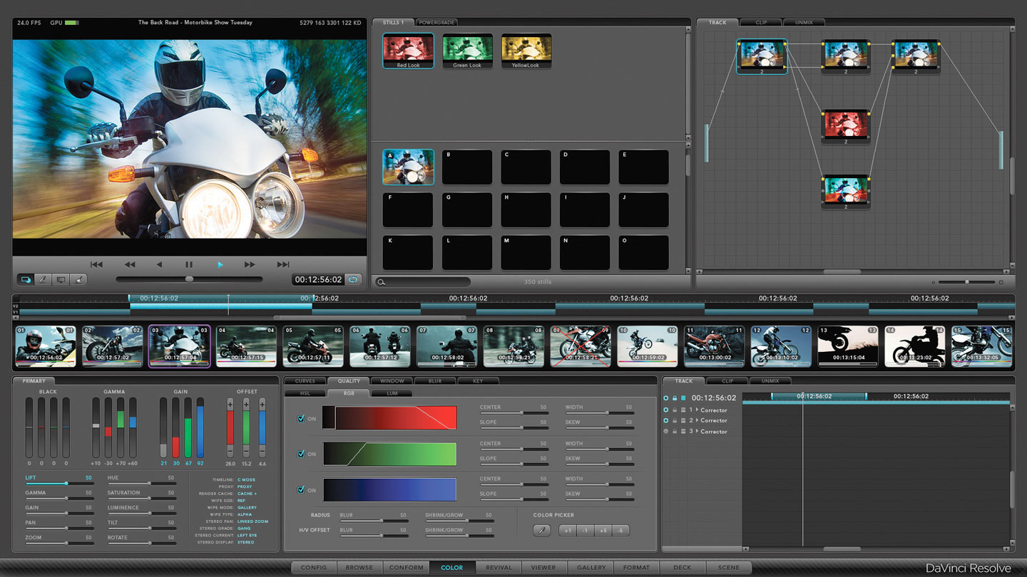
Blackmagic Design’s DaVinci Resolve (image: supplied).
This was a lighthearted reply but it was also the truth, at least at first. With all my experience of lighting and balancing front and rear projection plates to foreground lighting, I have spent years looking through viewfinders, and more recently production monitors, asking myself, “What wrong with this picture?”
So in short, my entire philosophy of lighting and coloring is reduced to asking myself, “What’s wrong with this picture?” Then twiddling the knobs until there is no longer anything wrong with it. 9 times out of 10, it’s a great looking image.
START AT ZERO
But, of course, there is more to it than that. The human eye quickly adapts to any given amount of light and contrast ratio, but the silver screen and the 4K TV do not. Therefore, when we expose a negative or grade a digital image for screening, we need a mechanical or digital aid to tell our eyes what the zero point is.
When we shoot, that aid is usually an exposure meter, but more and more often now it’s a waveform or histogram. When we grade images, that aid is a waveform, vector-scope, etc., which quantifies exactly what data is going onto the digital negative and how it will look on any given device, be it a TV or cinema screen.
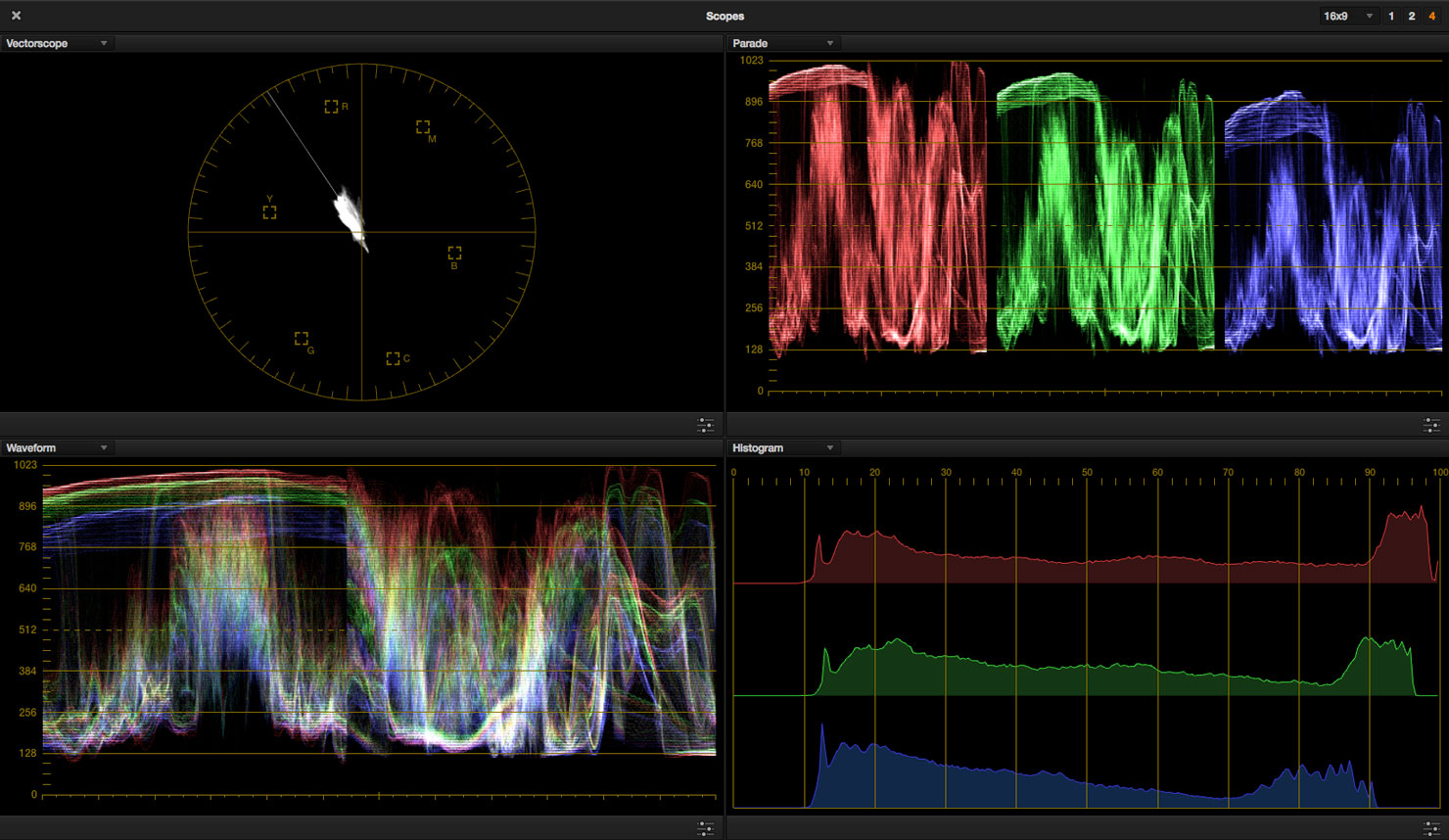
Scopes in DaVinci Resolve.
But there’s a lot more to keeping a zero point than you would think. Every device in the image supply chain need to be in calibration, starting with the camera, to the color correction monitor/projector, to the final display device. And in the digital age (or the Wild West as it is affectionately known in tech circles) everyone is desperately trying to establish some standards to adhere to.
While image standards were basically static for about 100 years, things have erupted in the last 20 or so and are now in a constant state of flux. And new standards like 4K and HDR are being introduced every day, with different manufacturers driving the market and with each product being a new standard all on its own. AHHHHH!
THEN ON TO WAVEFORM
But we digress. The waveform monitor, when we know how to use it, creates an image which will turn out exactly how we saw it in our minds eye.
Learning how to place any given image on the waveform, and knowing how it was going to look on screen, was the biggest lesson I needed to learn.
On the first project that I graded myself, I set the white at 100 IRE and the blacks at 0 IRE on the waveform. When I viewed the final result…it looked like really bad TV. I just couldn’t figure out why. I was horrified, considering I was going for Blade Runner or Lawrence of Arabia!
So I imported my favorite movies into Resolve and looked at the scopes. To my amazement, I saw that the really bright whites were at 60 and 70 IRE and the whole palate of the movie was in the range between 0 and 40-50 IRE. A scene I had worked on in Blade Runner flying over Los Angeles barely registered on the scope but looked fabulous on screen.
This revelation led me to a whole new way of looking at and grading my footage. Once you get into this mode and your eye gets used to it, you can fit your whole movie into this new contrast range. I liken it to a fine Pissarro painting, as the whole contrast range is squeezed into this super-narrow contrast-range where the difference between black and white is barely 1 stop.
Just because you have 0-100 IRE to play with, doesn’t mean you have to use it. And now with the advent of HDR, just because you have 0-10,000 IRE doesn’t mean you have to use it.
WHERE YOU WORK AND WATCH MATTERS
People like to grade in a darkened room, but this lets your eye drift and compensate. This is because the black room is still black, even if your image brightness changes significantly. If you don’t watch the scopes carefully, you will find your perception of contrast and your color pallet will shift as the day goes on.
I like to grade in a lit room because it stabilizes my eye and remains constant. I always know exactly what the zero-point looks like. Some color suites have lit 18% grey walls behind the monitor, but I never really liked this set up, because I’m still sitting in the dark.
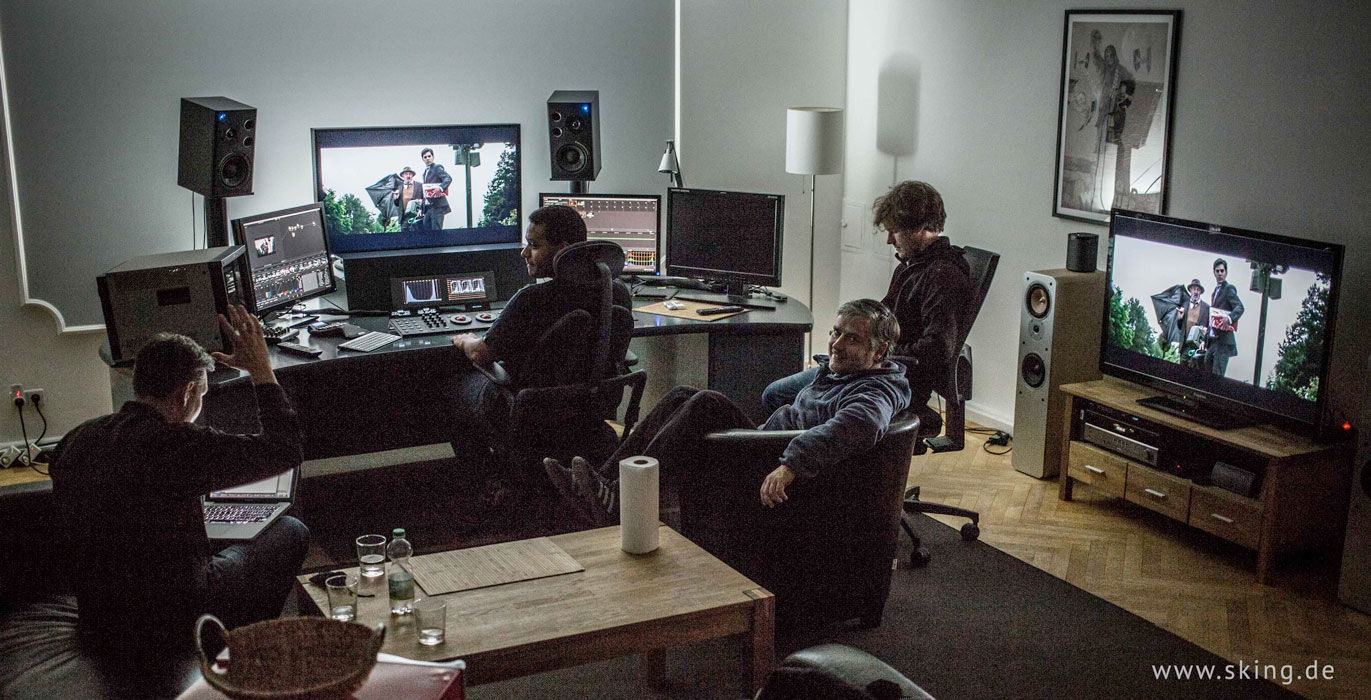
Colourist Stefan King’s Davinci Resolve Suite (image: sking.de).
In addition to my color monitor, I like to watch the image simultaneously on a big-screen LED TV and also on a computer screen with its sRGB color space. I try to make the image look good on all three devices simultaneously. This can be a big challenge, but I usually find a compromise between the three, and then I know I’m good to go.
I also like to play .mov files that I render in Quicktime 7 and in Quicktime 10 as there is a significant gamma difference between these two programs. Finding a good compromise will let your work look great on the web.
One last tip – I like to play back my work on my LED TV viewed off-angle, from one side. This gives me a very good idea of how smoothly my blacks are behaving and whether I have any super-blacks which will fail QC at a later date.
I used to have crises of confidence half way through any given project, but the better I get to know my monitor, and the more experience I have placing my images on the scope, the stronger my confidence in the process and final result.
Happy coloring.
ABOUT THE AUTHOR
Bruce Logan, ASC was born in London. His love of imagery started when he was hired by Stanley Kubrick to work under Douglas Trumbull on 2001: A Space Odyssey. He came to California in 1968 and worked as a DP on over a dozen films, including: Tron, Star Trek, Airplane, Firefox, High Road to China, The Incredible Shrinking Woman, I Never Promised You a Rose Garden, Big Bad Mama, and Jackson County Jail. He did visual photography for most of these films as well. He has shot commercial films for most of the major companies: Pepsi, GE, Visa, Chevrolet, Pontiac, DuPont, Contac, Sprint, Amtrak, Suzuki, Sunlight, and Armstrong. And—he has applied his talents to making music videos for such high profile performers as Prince, Madonna, Rod Stewart, Aerosmith, Glenn Frey, The Go-Gos, Karyn White, Tevin Campbell, Hank Williams, Jr., and Michael Cooper.
You can check out Bruce’s full bio, HERE.

